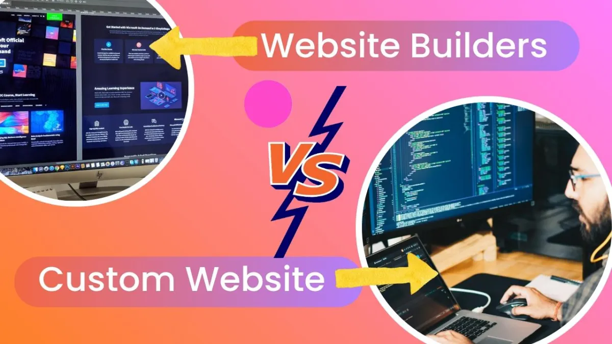

THE ULTIMATE GUIDE TO HIGH‑CONVERTING LANDING PAGES
Most landing pages fail silently because they force visitors to work too hard to understand what to do next. High-converting landing pages use clarity, sequence, and emotional safety to guide visitors toward one specific action.
This guide provides a proven framework, real examples, common mistakes to avoid, and practical steps to build landing pages that actually convert.
Introduction: The Silent Failure of Most Landing Pages
When a landing page receives traffic but does not generate conversions, the problem is usually not the offer. In most cases, the audience is appropriate, the timing is sufficient, and the technical setup is adequate.
The more common issue is that the page demands too much mental effort from visitors. Even when nothing appears obviously incorrect, small points of friction accumulate. These subtle obstacles interrupt the user’s flow, reduce momentum, and shift attention away from the intended action.
Such pages do not fail because of clear or visible mistakes. They fail quietly. Visitors often do not recognize the source of their hesitation. They simply experience a brief moment of uncertainty or a sense that continuing will require more effort than expected.
As perceived effort increases, attention declines. Understanding this dynamic is essential for creating landing pages that convert consistently.
Why Landing Pages Fail
Most landing pages underperform because elements are continually added rather than refined. Additional sections, calls to action, explanations, and reassurance each appear reasonable individually, but collectively they create friction. Friction slows decision-making and reduces conversions.
Common sources of friction include:
Excessive choices presented simultaneously
Too much context before relevance is established
Multiple explanations competing for attention
Individually, these issues seem minor. This leads to decision fatigue, a well-documented psychological effect where people default to inaction when faced with too many options. Harvard Business Review has extensively covered how decision overload reduces action rather than increasing confidence
High-performing landing pages succeed not by increasing pressure but by reducing complexity.
The Moment Conversions Are Won or Lost
Visitors form an initial impression within seconds of arriving on a landing page. This impression determines whether they will continue engaging or exit the page.
They are not evaluating service details or business history. Instead, they are assessing relevance and support.
The core questions they are subconsciously asking are:
“Is this page meant for someone like me?”
“Will this help me move forward without unnecessary effort?”
If the page fails to answer these immediately, engagement drops. According to Nielsen Norman Group’s usability research, cognitive load and unclear structure are among the top reasons users abandon pages early.
What a Landing Page Actually Is
A landing page is not a general website page. It is not an about page, a portfolio, or a comprehensive explanation of a business.
A landing page is a decision environment designed for a single purpose:
to guide a visitor toward one clear action in a way that feels obvious, safe, and easy.
Any element that competes with this purpose reduces conversion potential. This is why concise, focused pages often outperform longer pages with more elaborate copy.
Key Statistics
Average landing page conversion rate: 2.35%
Top 10% of landing pages convert at 11% or higher
Removing navigation links can double conversions
A single CTA can triple conversions
Visitors decide whether to stay or leave within 3–7 seconds
More than 70% of landing pages lack a clear headline
These data points reinforce a central principle: clarity is the most valuable skill in digital marketing. (Source: WordStream landing page benchmarks)
The Framework Behind Pages That Consistently Convert
A biggest misconception is that more information increases trust. In practice, clarity and trust depends on the sequence of information, not the volume.
When a page answers questions before visitors are ready to ask them, cognitive load increases, leading to hesitation.
A “clarity leak” occurs whenever a visitor must ask:
“What does this mean for me?”
“What should I do next?”
Each moment of uncertainty reduces momentum. High-converting pages are not flawless; they are simply free of clarity leaks.
The Clarity Path Framework
High-performing landing pages follow a consistent psychological progression.
This progression reflects how visitors evaluate relevance, reduce uncertainty, and decide whether to act.
Rather than functioning as a checklist of page elements, this model explains how decisions unfold in sequence.
At a high level, effective landing pages guide visitors through five stages:
Recognition → Relief → Direction → Safety → Action
If a landing page fails at any stage, forward momentum stops and conversions decline.
Each stage is supported by specific structural elements on the page.
How the Five Stages Translate Into Page Structure:
Stage 1: Recognition
Goal: Establish immediate relevance.
Visitors need to quickly recognize that the page is intended for them.
This typically happens through:
Clear audience identification
A headline that reflects a specific transformation or outcome
If recognition does not occur early, visitors exit without engaging further.
Stage 2: Relief
Goal: Reduce uncertainty and build initial trust.
Once relevance is established, visitors need to feel that their situation is understood and that improvement is possible.
This stage is supported by:
Emotional validation of the visitor’s problem
Benefits that reflect meaningful outcomes rather than features
If relief is not established, skepticism remains high.
Stage 3: Direction
Goal: Make the next step explicit.
Visitors need to understand exactly what action is being asked of them and what that action leads to.
This is supported by:
A single, primary call to action
Effortless Understanding
When direction is unclear, hesitation increases.
Stage 4: Safety
Goal: Lower perceived risk.
Before committing, visitors evaluate whether taking action feels reasonable and low-risk.
This is where social proof matters. Research on social proof psychology shows that people rely heavily on others’ experiences when uncertainty is present.
Effective social proof highlights:
Emotional shifts
Clarity gained
Confidence restored
Stage 5: Action
Goal: Enable commitment with minimal friction.
At this point, the visitor should encounter:
One clear, simple action
A closing message that feels supportive rather than pressuring
If the action is unclear or feels burdensome, conversions stop.
Supporting Page Elements
To move visitors through these five stages, high-converting landing pages commonly include the following elements:
Immediate Recognition
A Transformation, Not a Description
Emotional Validation Before Strategy
One Focused Call To Action
Effortless Understanding
Outcomes That Feel Personal
Trust-building social proof
A Close That Feels Supportive
These elements are not independent.
They function together to support the decision process.
Why This Model Works
Visitors do not move through a landing page by analyzing every detail logically. Their progression is psychological, not mechanical. They respond to how the page makes them feel, how easily they can understand it, and how safe the next step appears.
This five-stage model ensures that:
Relevance precedes persuasion
Understanding precedes commitment
Safety precedes action
When these stages are aligned, taking action feels natural rather than forced.
Detailed Breakdown of Each Step
1. Immediate Recognition
A landing page must immediately signal who it is designed for. When visitors recognize themselves in the first few lines, they experience an instant reduction in cognitive resistance.
Weak example: “For anyone who wants to grow online.”
Strong example: “For overwhelmed coaches who want consistent leads without burnout.”
Precise audience recognition increases relevance, strengthens attention, and sets the foundation for trust. When visitors feel accurately identified, they are more willing to continue reading and more open to the solution presented.
2. A Transformation, Not a Description
The headline is the most influential element on a landing page. Visitors do not respond to descriptions of services; they respond to the transformation those services create.
Examples:
“Build a landing page that turns visitors into booked calls.”
“Create a conversion system that works without pressure or complexity.”
A transformation‑driven headline communicates value instantly. It shifts the visitor’s focus from what the business does to what the visitor gains, which is the core driver of conversion behavior.
3. Emotional Validation Before Strategy
Before logic can persuade, emotional resistance must decrease. High-performing landing pages acknowledge the visitor’s current frustrations, challenges, and past disappointments.
Validation is not about sympathy; it is about demonstrating accurate understanding.
When visitors feel seen and understood, they naturally trust the page more. This trust becomes the emotional foundation that allows the rest of the page to guide them toward a decision.
4. One Focused CTA
A landing page must revolve around a single primary action. Multiple CTAs create cognitive branching, which increases hesitation and reduces conversions.
A single CTA:
Creates momentum
Reduces decision fatigue
Reinforces clarity
When the next step is unmistakable, visitors are more likely to take it.
5. Effortless Understanding
Most visitors do not read landing pages line by line. They scan for relevance, clarity, and value.
Effective pages use:
Short paragraphs
Bullet points
Clear subheadings
Plain, direct language
Outcome‑oriented statements
If the offer cannot be understood within a few seconds of scanning, the page is too complex for cold or lukewarm traffic.
6. Outcomes That Feel Personal
Features describe what is included. Benefits describe why it matters.
Features inform. Benefits motivate.
Weak: “Includes custom copy and design.”
Strong: “Confidence sending traffic to a page that finally makes sense.”
Outcome‑focused benefits connect the offer to the visitor’s desired emotional and practical results, which is what ultimately drives action.
7. Trust‑Building Social Proof
Social proof reduces perceived risk. Testimonials, case studies, and screenshots serve as reassurance that the promised transformation is achievable.
Effective social proof highlights:
Emotional shifts
Clarity gained
Confidence restored
Tangible improvements
Authenticity is more persuasive than polish. Visitors respond to real experiences that mirror their own challenges and aspirations.
8. A Close That Feels Supportive
The final section of a landing page should reinforce confidence and make the next step feel manageable. It should not pressure the visitor; it should empower them.
An empowering close:
Reassures the visitor
Clarifies the value of taking action
Removes lingering hesitation
When the next step feels safe and reasonable, conversions increase.
Why Clarity Is More Critical Than Ever
In today’s digital environment, users are constantly exposed to competing messages, complex interfaces, and excessive demands on their attention. Every page they visit requires effort; mental, emotional, and cognitive - to interpret, evaluate, and decide. This saturation leads to overwhelm. Visitors do not have the capacity to engage deeply with every page. They instinctively prioritize clarity, relevance, and ease.
Landing pages that perform well in this climate are not louder or more aggressive. They are more refined.
Effective pages:
Minimize cognitive effort (to interpret, evaluate, and decide)
Present information in a structured, intuitive format
Feel respectful of the visitor’s time and attention
Create a sense of calm and confidence
Make the next step feel obvious and low-risk
In a landscape of noise, clarity becomes a competitive advantage. Pages that feel human, focused, and easy to navigate consistently outperform those that rely on complexity or intensity. Google’s own research on mobile behavior confirms that friction and slow comprehension lead to abandonment.
Landing pages that perform well today are not louder. They are clearer.
A Counterintuitive Truth About Conversion
The highest-converting landing pages are rarely exciting.
They are calm.
Complex or visually overwhelming pages may appear impressive, but they often introduce unnecessary friction. Excessive stimulation forces visitors to work harder to understand the offer, evaluate the next step, or determine relevance. As mental effort increases, the likelihood of action decreases.
In contrast, calm pages:
Present information in a structured, digestible sequence
Minimize distractions and competing elements
Support rapid comprehension
Create a sense of stability and trust
Guide visitors toward a single, clear decision
The goal is not to entertain but to enable.
A landing page that feels calm allows visitors to move through the decision process without resistance, resulting in higher conversion efficiency.
Common Myths That Reduce Conversions
Many landing pages underperform because they rely on outdated assumptions:
Myth: More information increases trust Reality: Information without structure increases confusion.
Myth: Better design guarantees higher conversions Reality: Design supports clarity; it does not replace it.
Myth: Urgency alone persuades Reality: Urgency without clarity feels manipulative.
Myth: Multiple CTAs create flexibility Reality: Multiple CTAs create decision paralysis.
Clarity consistently outperforms volume, pressure, and complexity.
Frequent Mistakes
Underperforming landing pages often share predictable issues:
Speaking to a broad audience
Overexplaining or providing unnecessary detail
Using vague or generic headlines
Ending abruptly without reassurance
Including too many links that distract from the primary action
Mixing multiple goals on a single page
Correcting these issues alone can significantly improve conversion rates.
Advanced Conversion Psychology
High-performing landing pages leverage well-established psychological principles:
Cognitive ease: The brain prefers simplicity.
Loss aversion: People avoid loss more strongly than they pursue gain.
Social proof bias: People trust what others have validated.
Identity alignment: Decisions strengthen when aligned with self-perception.
Emotional priming: Emotions influence interpretation of information.
Decision simplicity: Fewer choices lead to faster decisions.
These principles make clarity not only helpful but persuasive.
Visual Design Principles
Effective design enhances comprehension and reduces cognitive load. High-performing pages use:
High contrast for readability
Generous white space to reduce visual clutter
Clear hierarchy to guide the eye
Minimal distractions to maintain focus
Mobile-first layouts to support the majority of visitors
Design should amplify clarity, not compete with it.
Mobile Optimization
With more than 70% of landing page traffic coming from mobile devices, mobile optimization is essential.
Effective mobile pages:
Load quickly
Use large, accessible buttons
Keep paragraphs short
Maintain visible CTAs throughout the page
Mobile friction is one of the most common causes of conversion loss.
Copywriting Techniques
High-converting copy follows predictable patterns:
Use “you” language to maintain relevance
Lead with outcomes rather than features
Incorporate emotional cues naturally
Keep sentences concise
Use direct, action-oriented verbs
Clarity in language leads to clarity in decision-making.
Social Proof Strategy
Effective social proof formats include:
Before-and-after stories
Emotion-centered testimonials
Screenshots of real results
Short, focused case studies
The goal is not to impress but to reassure.
CTA Optimization
Strong CTAs are:
Clear
Actionable
Benefit-driven
Repeated consistently
Examples:
“Book your clarity call”
“Download your free guide”
“Start your transformation”
Clarity consistently outperforms creativity in CTAs.
Before/After Example
Before:
Headline: “Full-Service Marketing Solutions”
CTAs: Contact Us, Learn More, View Services
Conversion rate: 1.9%
After:
Headline: “Turn Website Visitors Into Booked Calls in 14 Days”
CTA: Book Your Free Strategy Call
Navigation removed
Conversion rate: 6.3%
The offer did not change. The clarity did.
The improvement came from removing competing decisions, not adding more persuasion.
Immediate Action Steps
To improve a landing page today:
Remove navigation links
Rewrite the headline to reflect transformation
Replace features with emotional outcomes
Add 2–3 authentic testimonials
Use one CTA throughout
Break long text into skimmable sections
Remove elements that compete with the primary action
Small, targeted adjustments often produce disproportionate conversion gains.
FAQs
❓How long should a landing page be?
💡 A landing page should be only as long as it needs to be to create clarity and confidence. Some pages convert well with very little content. Others require more explanation, reassurance, or examples. Length itself is not the problem. Confusion is.
If a visitor can quickly understand:
who the page is for
what outcome it offers
what action to take next
why that action feels safe
then the page is long enough. Any content that does not support those goals is likely adding friction rather than value.
❓Should pricing be included?
💡 Pricing should be included only when it reduces hesitation. For simple or low-commitment offers, showing pricing can build trust and filter out uncertainty. For higher-touch or customized services, introducing pricing too early can raise objections before value is fully understood. The guiding question is not “Should pricing always be visible?” but rather: “Does showing pricing make the decision easier right now?” If it does, include it. If it creates unnecessary resistance, it can wait until after the initial action is taken.
❓Should navigation be removed?
💡 In most cases, yes. It typically increases conversions. Navigation gives visitors multiple ways to leave instead of one clear way to move forward. While this feels polite or flexible, it often increases cognitive load and decision fatigue. Removing navigation does not trap visitors. It simply reduces distraction. Visitors can still leave at any time. What changes is that the page becomes focused, calm, and easier to understand. This clarity often leads to higher engagement and stronger conversions.
❓How many CTAs should be used?
💡 A landing page should have one primary call to action, repeated consistently. This does not mean the CTA appears only once. It means every CTA on the page points to the same next step. When multiple CTAs ask for different actions, visitors are forced to decide what matters most. That decision slows momentum and often leads to inaction. A single, repeated CTA creates confidence. It reassures visitors that they are moving in the right direction.
❓ What is the biggest landing page mistake?
💡 A landing page should have one primary call to action, repeated consistently. This does not mean the CTA appears only once. It means every CTA on the page points to the same next step. When multiple CTAs ask for different actions, visitors are forced to decide what matters most. That decision slows momentum and often leads to inaction. A single, repeated CTA creates confidence. It reassures visitors that they are moving in the right direction.
❓ How do I know if my landing page is confusing?
💡 A landing page is likely confusing if:
Visitors scroll but do not click
Traffic is steady but conversions are low
People ask basic questions the page should answer
You feel the need to explain the page verbally
Confusion is usually a signal that the page is asking visitors to think too hard too early.
❓ Do landing pages need to be persuasive?
💡 Landing pages do not need to be aggressive or persuasive. They need to be clear. When a page accurately reflects the visitor’s situation, explains the outcome simply, and makes the next step feel safe, persuasion happens naturally. Clarity removes resistance. Pressure increases it.
Conclusion and Next Step
High-converting landing pages respect attention, reduce friction, and create a sense of safety. A focused audit or strategy session can reveal exactly where clarity is leaking and how to restore it for consistent, predictable conversions.
👉 Request a landing page audit or strategy session
We’ll help you turn clarity into conversions, without complexity or burnout.