About this project
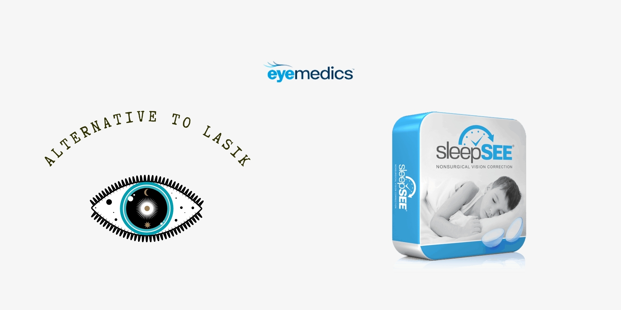
Eyemedics offer a non-surgical vision correction procedure called: sleepSEE. Its great for ages six years old and up. Its also great for peoplewho had LASIK surgery but now notice their vision isn’t as clear as it was when they first got the surgery.
Their target audience are people who want to slow down the progression of nearsightedness in their children, people who enjoy active lifestyles and want to be free of the annoyances of glasses or
contacts, and people who are looking for an alternative to LASIK.
Challenges
Combining a product and service: Creating a website that efficiently presents both the sleepSEE product and the non-surgical vision correction service.
Visual Scientist’s Perspective: Balancing detailed explanations typical in medical contexts with a visually appealing and minimalistic design.
Engaging Target Audience: Designing an interface that resonates with active individuals, parents concerned about their children’s eyesight, and those seeking an alternative to LASIK.

Approach
Homepage
- Utilize a rotating hero section with visually striking images to convey the core message: “Correct Your Vision While You Sleep.”
- Integrate dynamic shapes and icons to add character and avoid a boxy appearance.
- Implement a clean layout with a stationary navigation bar for easy navigation.
Areas of Focus
- Clearly delineate the five key areas on the homepage for quick access to information.
- Create visually appealing sections such as “LASIK Challenge” with a captivating ribbon element to build viewer confidence.
Promotion Section
- Design a visually impactful LASIK Challenge section, emphasizing the risk-free trial and incentives.
- Highlight financing options prominently for increased visibility.

Email Capture Section
- Feature a newsletter signup with a compelling headline and CTA button, strategically placed on the homepage.
- Incorporate social media buttons to encourage engagement.
Header and Footer
- Craft a concise yet comprehensive navigation menu to guide users seamlessly.
- Ensure the language dropdown, contact information, and social media buttons are strategically placed for user convenience.
Additional Features
- Implement an eye-catching infographic clock in the “How Does it Work?” section for visual explanation.
- Incorporate a Blog page named “EyeThink by Dr. Sing” for more in-depth information and updates.
- Provide a Doctor Login option for professional collaboration.
Visual Elements
- Use beautiful fonts from Google Fonts for a polished appearance.
- Apply attractive language dropdown lists and cool icons for enhanced visual appeal.
- Employ a responsive design for optimal user experience across devices.
Updates and Final Touches
- Ensure all children in pictures look 7 years old or older for consistency.
- Remove the search box as per client preference.
- Place the “Financing Available!” icon prominently on the homepage.
- Include a product packaging picture for a comprehensive view.
Lorem ipsum dolor sit amet, consectetur adipiscing elit. Ut elit tellus, luctus nec ullamcorper mattis, pulvinar dapibus leo.


