
Responsive Design: Enhancing User Experience in a Mobile World
In the fast-paced digital landscape of today, where mobile devices have become an integral part of our daily lives, the significance of responsive design cannot be overstated. Users expect seamless experiences regardless of the device they use, and responsive design is the key to meeting these expectations.
The Mobile Revolution
Mobile devices, including smartphones and tablets, have become the primary means through which users access the internet. According to recent statistics, a significant percentage of web traffic originates from mobile devices. As a result, it is imperative for websites to adapt and provide a user-friendly experience on screens of all sizes.
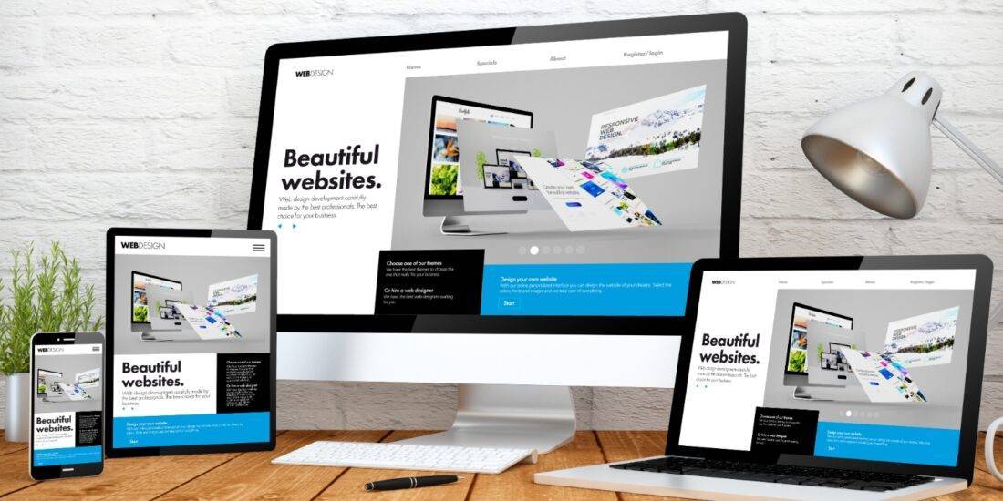
What is Responsive Design?
Responsive web design is an approach to web design that ensures a website’s layout and elements adapt dynamically to different screen sizes. Instead of creating separate designs for desktop and mobile, a responsive design allows a single design to respond and adjust based on the user’s device.
Benefits of Responsive Design
- Improved User Experience: Responsive design ensures that users have a consistent and optimized experience across all devices, promoting user satisfaction and engagement.
- Better SEO Performance: Search engines, including Google, favor mobile-friendly websites in their rankings. Responsive design contributes to better search engine optimization (SEO) and higher visibility in search results.
- Cost-Efficiency: Developing and maintaining a single responsive website is more cost-effective than managing separate desktop and mobile versions.
- Adaptability to Future Devices: As new devices with varying screen sizes are introduced to the market, responsive design ensures that your website remains adaptable without requiring a complete overhaul.
Implementing Responsive Design: Best Practices
- Mobile-First Approach: Start designing for mobile devices first, and then progressively enhance for larger screens. This ensures a solid foundation for the mobile experience.
- Flexible Grids and Layouts: Use fluid grids and flexible layouts to create designs that can adapt to different screen sizes.
- Media Queries: Utilize CSS media queries to apply different styles for different devices, ensuring an optimal viewing experience.
- Optimize Images: Compress and optimize images to reduce page load times, especially on mobile networks.
- Testing Across Devices: Regularly test your website on various devices to identify and address any issues promptly.
Conclusion
Responsive design is not just a trend; it’s a necessity in the ever-evolving digital landscape. By prioritizing user experience across all devices, businesses can not only meet the expectations of their audience but also enhance their online presence and performance. In the competitive world of digital marketing, embracing responsive design is a strategic move that can make a significant difference in attracting and retaining users.